

As technology evolves, so do user expectations. In 2026, we are see...
19 Feb 2026
Top 10 UI/UX Design Trends in 2026
Continue Reading...


The optimal viewed experience that users get while browsing along with reading, navigating, scrolling minimally, cross-device responsive website compatibility is the approach followed by the responsive website design.
It is important to know how responsive a website is in order to find out its rank in the search engine platform. There are several responsive testing tools that can help in performing website responsive test in a more or less similar manner.
The primary mottos of the responsive websites are to provide users with a fluent experience diving them through the world of browsing discarding the fact that which device is providing the privilege.
The websites adapt all the different size of screens as well as their resolution and give a very smooth touch in all the corresponding devices. The lists of devices it can use are Laptops, Desktops, and so on.
Using a simple website is likely to throw a lot of chances of receiving a maximum number of customers. Using separate websites that serve the desktop and laptop are just not enough as all that it will bring along is more outcomes and a very high maintenance cost.
Therefore, it is important to take a step forward in the direction that leads us to the responsive websites, ensuring the fact that the responsive website compatibility is cross-browser or not. For checking the responsive design testing across devices and as well as responsive website compatibility, there are several websites responsive test and tools that are not only free but work online too.
Responsible web design testing tool is a very efficient and fast way to find out about the responsive design. It is very smart with its action and very quickly sneaks the reviews of the pages on the web online. It saves a lot of time and also brings forward the appearance of the website after it has gone through website responsive test.
These few widely used tools are here to fix all the purpose of reserved domain and cost maintenance. Welcome to the tour that will take you through the best responsive website tool experience of all time.
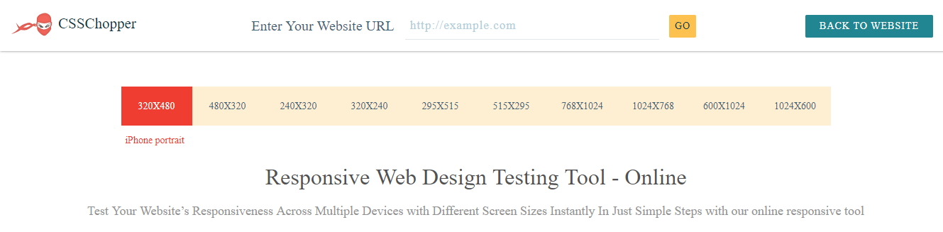
CSSChopper is known for the breaking new ground and holding a position of leading the way in any firm it enters. It is trustworthy and has helped in satisfying a ton of users. They aim to make the best web design with their developed services and provide the most effective solutions across diverse upright. They start from front-end engineering stretching all the way to theme and custom web development. All these blends are responsible for making a website successful as well as taking the clients to the place they deserve.
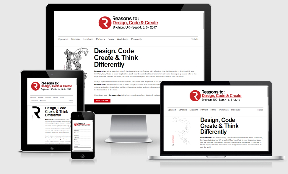
This tool is basically a time-saving exercise. The general function includes taking a plenty of screenshots that occur in the device at various breakpoints for going through responsive design. The tools used in Am I Responsive help it getting used pretty quickly and helps a lot in bringing up more and more clients visual who well define the term responsive design. This is not the tool for testing but a power pack to quickly take up screenshots to get what they want.

Responsinator is a responsive design for those who are interested in website making. It helps the makers by providing them with an illustration of how pleasing there website will look on the devices like Laptops and Desktops. However, it will not show exactly how it will look but will serve a more or less similar replica. It is advised to do website responsive test on real devices only. When using Responsinator on Google Chrome, it is a good idea to convert the scrollbars too when scrolling.
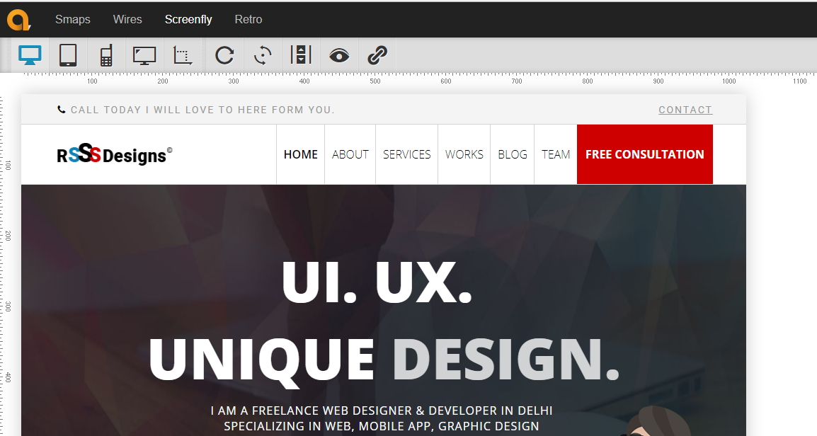
The overall views provided by Quirktool account to 27 and are completely compatible with all the running devices like tablets, laptops and desktops. This tool comes in handy for all those creative people out there who receive help from their end. It is the perfect platform that serves a sleek-user interface and helps in testing screen resolutions for all screen size.
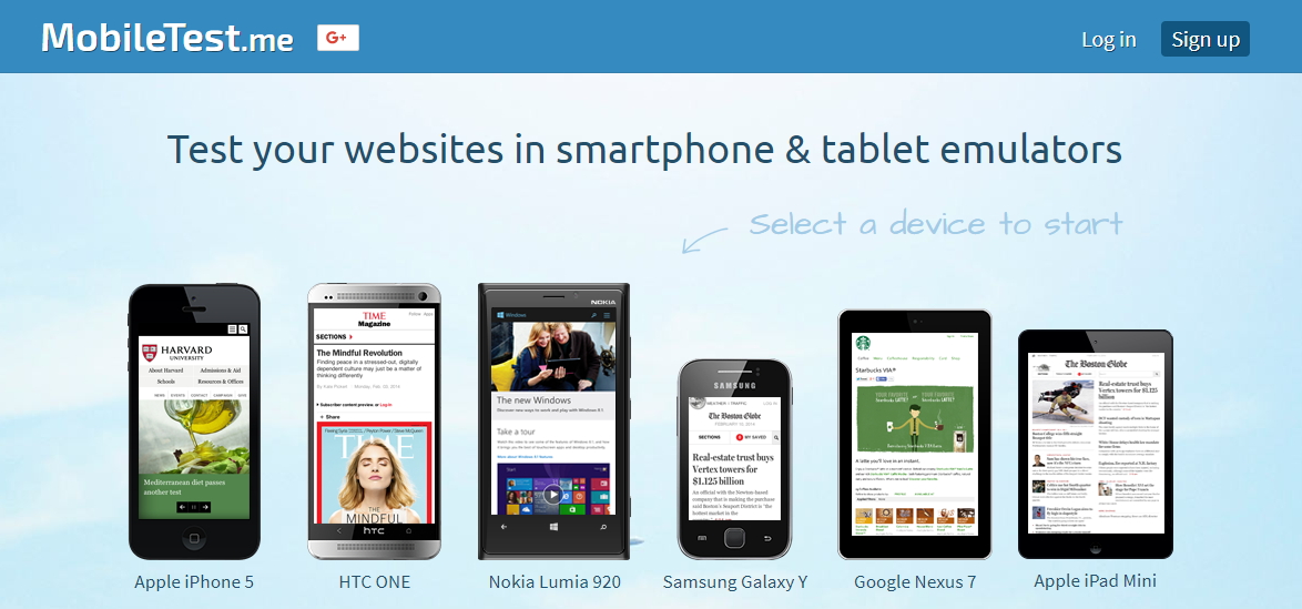
This is one of the best responsive website design tools that runs perfectly on all mobile devices without any abruption. It allows using mobile emaluation free for a month. The procedure starts with gathering all the information that is required for building the application and then understanding the flow of the application and then building the test plan for the same.
Creative Head
As technology evolves, so do user expectations. In 2026, we are see...

In today's digital age, your website is often the first interac...

In the dynamic world...

In t...
In the dynamic landscape of online conten...
In the world of web and app de...