

As technology evolves, so do user expectations. In 2026, we are see...
19 Feb 2026
Top 10 UI/UX Design Trends in 2026
Continue Reading...


Make sure to keep the strategy and layout of the website minimalistic. Too much of things cluttered up together tend to be confusing for the user visiting your website. People should be able to understand what the company does as soon as they land on the webpage. Let the attention be directed to the most significant section of the website. For a more professional look, place a logo of your company as the link to the landing page or the homepage of your website. Navigation methods should be clearly visible and easy to use for a better user experience. Finding information on the website should not be hectic task. Include a button to navigate to home page on every page of the website.
Before starting designing the final layout for the website make sure to do a bit of digging up on different model designs available over the internet. Google designs give you variety of choices. It is a group of designers and developers at Google. It is always better to see all of the options so that you choose the best one according to your type of website. Earlier, sidebars were extensively used. But surveys have shown that people hardly use sidebars and they are left as a cluttering feature of the website.
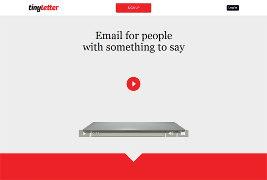
While choosing the images to be displayed on the website, it is critical that the images should be taken by a professional photographer i.e. it should be of fine quality. The images should comply with what the website is about. The combination of quality content and the right imagery is the key for enhancing the user experience.
Poor quality pictures can decrease the attractiveness of the website to a great extent. Avoid using free pictures available on various platforms. For the best results, invest in some money and choose the premium images of the finest quality. Use these images in a slider to bring focus on the key topics.
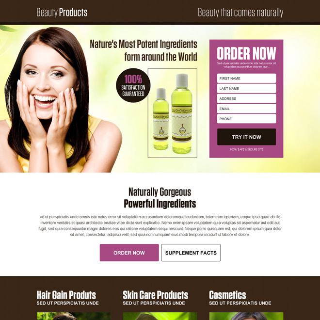
The colour scheme of the website should be pleasing to the eye. Always use mild colours rather than colours which might be too tacky to look at. A simple colour scheme will give your website a more polished look. They should never obscure the text content of the webpage.
Typography is the most essential feature of a website. The text is almost every time preferred to be black, avoid coloured texts unless they are hyperlinks which should be blue as per the usual guidelines. Every button should have text, avoid icon links. All the visitors may not be able to decipher what each icon stands for. Most commonly used fonts are Arial, Georgia and Time New Roman.
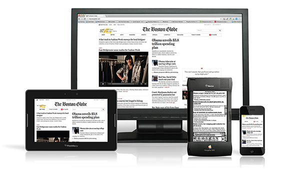
In the current scenario, 80.5% of the web visitors are accessing your website from devices like Smartphones and tablets as compared to computer systems. So, responsiveness is not a choice but a need. The websites layout and navigation through the content should be as easy on a Smartphone as it is on a desktop.
The text should be easily readable on a mobile version of the website and the images used should accordingly resize themselves to provide the best fit for every screen size. The theme of the responsive website should be according the companys product. Along with being responsive it should be load quickly on varying internet speeds. Also, do not forget to add social media share and follow buttons. They will help to increase the reach of your websites content.
Creative Head
As technology evolves, so do user expectations. In 2026, we are see...

In today's digital age, your website is often the first interac...

In the dynamic world...

In t...
In the dynamic landscape of online conten...
In the world of web and app de...